Bar chart bars in Grapher display centered on their respective data ticks. This is Grapher's default.
To change the alignment so that the bars begin at the data value (as seen in the example below) see the following steps.
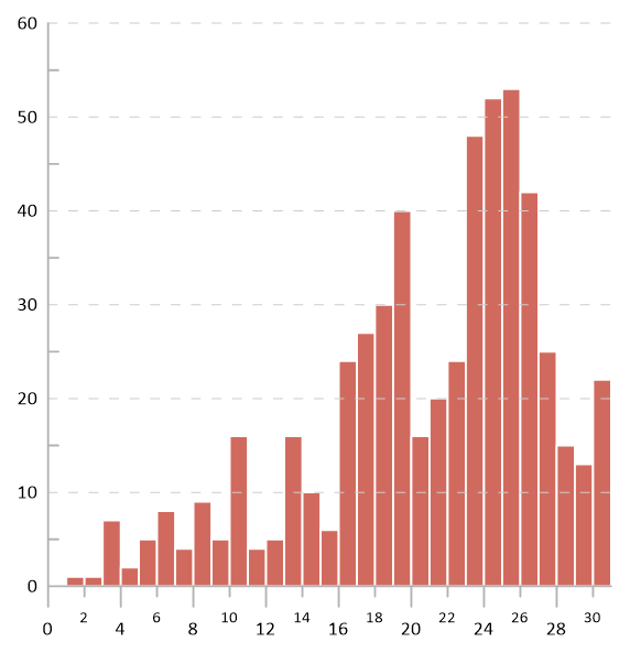
Bars are left aligned with the tick mark label.
Bar chart created from the Vertical Bar Chart in the BarCharts.gpj samples file.
- Click the Bar chart plot in the Object Manager.
- Click Graph Tools | Worksheet | Display.
- Add a new column to your data file and populate the cell with the original X value plus the width of the bar chart using the steps below:
- Click Data Tools | Data | Transform.
- In the Transform dialog, enter the equation C = A + 1, where C is the column the data will be populated; A is the column containing the X values; and the 1 is the bar width.
- The data updates immediately when the data is opened via the Display command, however, you may want to save your worksheet using the File | Save command.
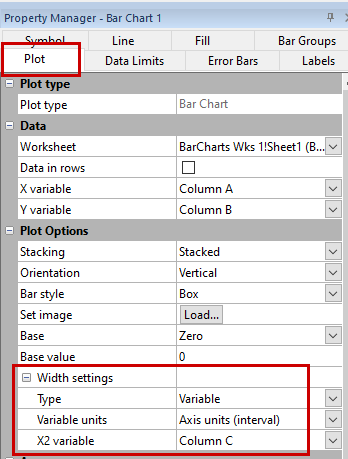
- Return the plot view and select your bar chart in the Object Manager.
- In the Property Manager, click the Plot tab.
- In the Plot Options section, expand the Width settings and change the Type to Variable.
- Set the Variable units to Axis units (interval).
- Set the X2 variable to the new x column you added to your data file. The bar chart bars will now start at the value.
Would you like to see a built-in feature to align the bars left, right, or center of a tick mark? Let us know and we'll add your vote!
March 2023
Comments
Please sign in to leave a comment.