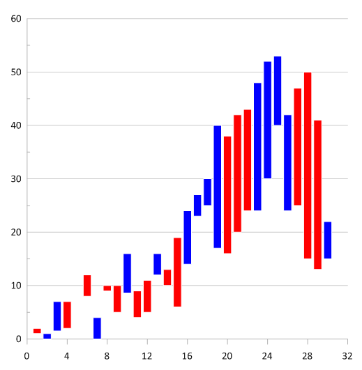
Automatic color fill of floating bar charts is not yet supported in Grapher. While it's not currently possible to automate fill colors based on the positive or negative difference between Y1 and Y2, you can still produce this display with the steps below.
- Click File | Open.
- Select your data file and click Open.
- Click Data Tools | Data | Transform.
- In the Transform dialog, assuming you just have three columns for X, Y1, and Y2, enter the below Transform equation where D is the column the results:
D = IF(B>C,"Red","Blue") - Click OK. This will enter the color name Red in column D where B (Y1) is greater than C (Y2), and it will enter the color name Blue if C (Y2) is greater than B (Y1). Any predefined colors can be used in this equation. To use a custom color, see the article Rearrange or Add Custom Colors to the Color Presets Menu in Grapher.
- If desired, enter "y1>y2" into the column D header.
- If your project file will be saved as a GRF file rather than a GPJ file, save this data file now to the same (File | Save) or a new (File | Save As) name.
- Highlight columns A-C and click Home | New Graph | Bar | Vertical Floating Bar Chart.
- Select the floating bar plot in the Object Manager.
- On the Fill page in the Property Manager, click in the Color variable column and select Column D or the appropriate column from step 5.
Please contact us if you would like to add your vote for this feature to our suggestion file.
Updated March 2023
Comments
Please sign in to leave a comment.