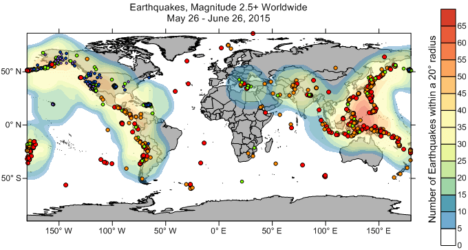
Heat maps, also known as density maps, transform complex data into clear, visual stories. They use color gradients to show the concentration of specific data points within a given area, helping you instantly spot patterns and trends. For example, an earthquake response team might use a heat map to identify global hotspots of seismic activity. While earthquakes happen worldwide, the most intense activity is often clustered along tectonic plate boundaries. With this insight, the team can focus their resources where they’re needed most.
Heat maps go far beyond earthquake data. Whether you're tracking webpage clicks, mapping crime rates in a city, surveying archaeological finds, or analyzing customer traffic in a shopping center, heat maps make it easy to visualize and communicate what’s happening beneath the surface of your data. Across industries, professionals rely on heat maps to uncover insights, guide decisions, and tell their data’s story with clarity and impact.
Create heat maps in Surfer depicting the number of occurrences in a given area.
To create a heat map in Surfer, all you need is a table of XY locations.
- Click Home | Grid Data | Grid Data.
- In the Grid Data - Select Data dialog,
- Select a data file from the Dataset 1 list on the right, or click Browse, select the data file, and click Open.
- Set the X and Y columns to the appropriate columns in the data file (X=longitude/easting, Y=latitude/northing), and set the Z column to any numeric column (Z won't be used here).
- Set the Gridding Method on the left to Data Metrics.
- Click Next.
- In the Grid Data - Data Metrics - Options dialog,
- In the Data Metric Parameters section, select either Count or Approximate Density from the Metric to interpolate list. Count gives you a straightforward count of the number of entities within the search radius. Approximate Density gives you the number of entities divided by the area of the search.
- In the Search Neighborhood section, uncheck None (use all data). A search ellipse must be used when the Gridding Method is Data Metrics.
- In the Search Ellipse sub-section, define the two search radii.
If you set the search radius too small, you will get tight patterns around each data point. If you set the radius too large, the density patterns will become too generalized. The units of the search radius are the same as the units of the X and Y values in the data file.
 Set the Radius 1 and Radius 2 values of the Search Ellipse to be the radius
around each grid node that you want Surfer to look for data.
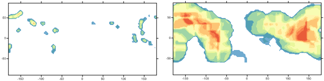 A smaller search ellipse of (left) produces patterns that are too tight around the data points,
and a search ellipse (right) creates patterns that are slightly too generalized.
-
-
- Click Skip to End.
-
- In the Grid Data - Data Metrics - Output dialog,
- Set the desired resolution of the grid file in the Output Geometry section. If you don't have a preference, the defaults are a good place to start.
- Give your output grid file a name.
- Make sure Add grid as layer to is checked, and select Contour from the New layer list.
- Click Finish and the grid and contour map are created.
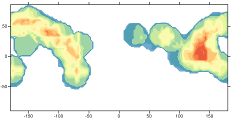
Create a contour map of the grid file and fill the contours with a color gradient.
Now that the map has been created, there are numerous customization options you can utilize to get to your final, professional output:
- Filter the grid to make the contours look smoother.
- Add additional map layers for context. For example, add a base layer to see where the contours are located, and/or add a post layer to see where the original data points are located with respect to the contours.
- Fill the contours and add a color scale.
- Color the points in the post layer based on a data value (like earthquake magnitude).
- Add a title to the map to describe what the map is showing.
- Format the axis labels in degree/minutes/seconds format if your X and Y values were in lat/long.
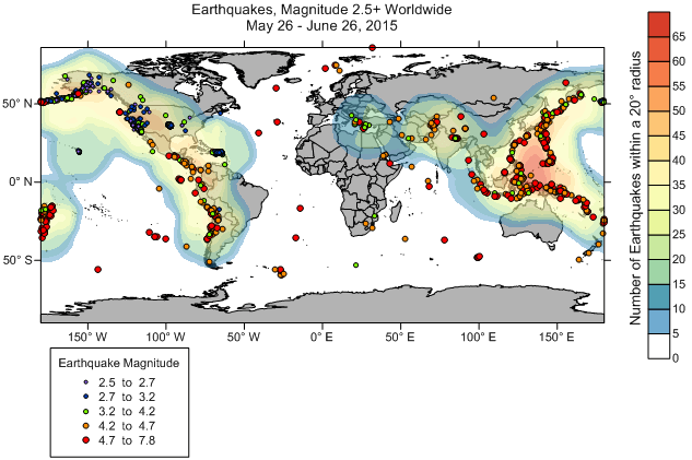
Finish the map by adding a color scale, a map title and formatting the axis labels.
Heat maps are an excellent way to quickly visualize and identify areas of interest, and are an important tool for any industry.
Comments
Please sign in to leave a comment.